Eseye
User flows
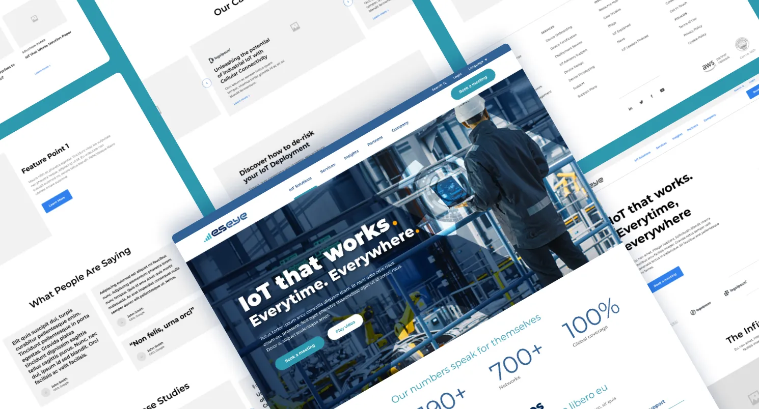
Helped to anticipate and gain an understanding of the journeys different personas would take on the website.
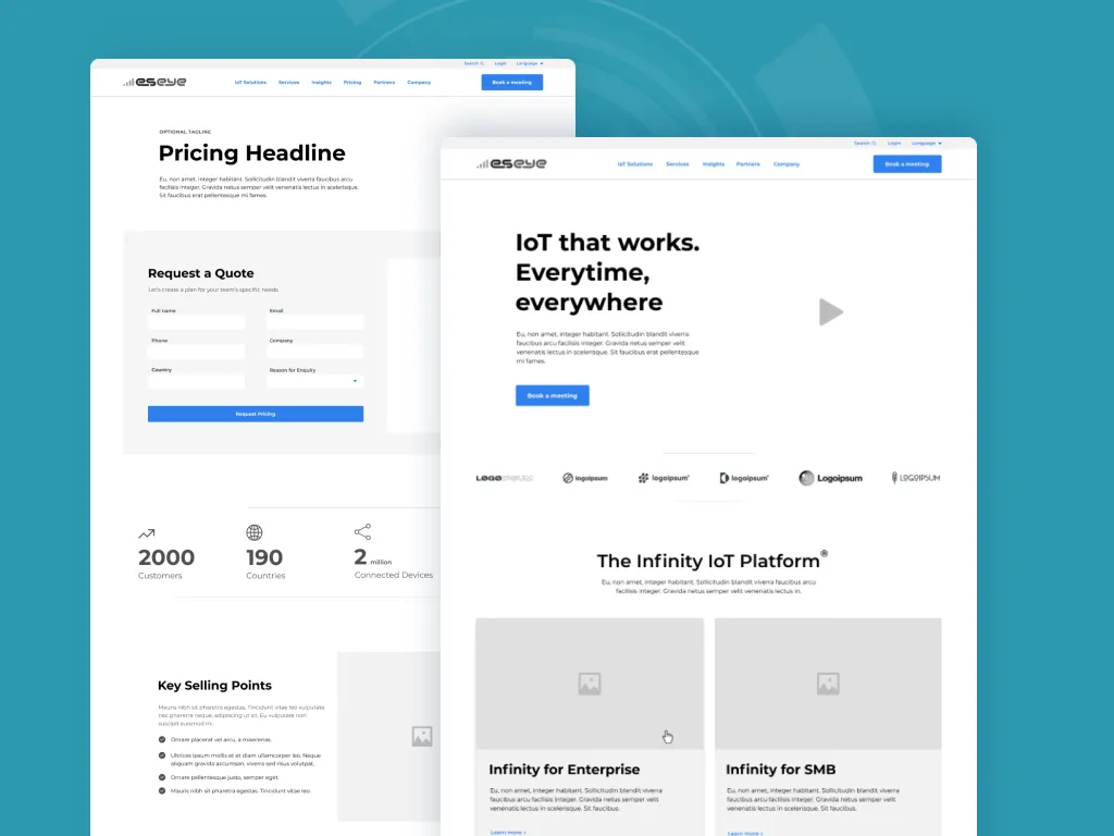
Wireframing
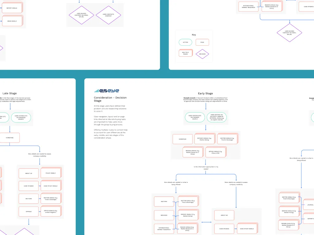
Following on from user flows and content planning, wireframes confirmed all module functionality and how information will be organised. The full design process was done in Figma.
Branding
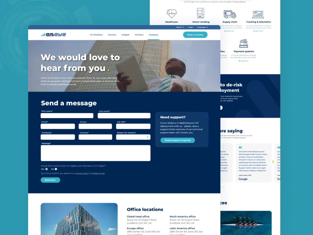
Inline with the company's brand archetype of the 'Ruler', this design has been effective in modernising their look and has helped establish them as a leader in their industry.
High conversions
With an acute focus on user experience, this new website has been effective in assisting the sales department in generating new leads.


Brand new look and feel
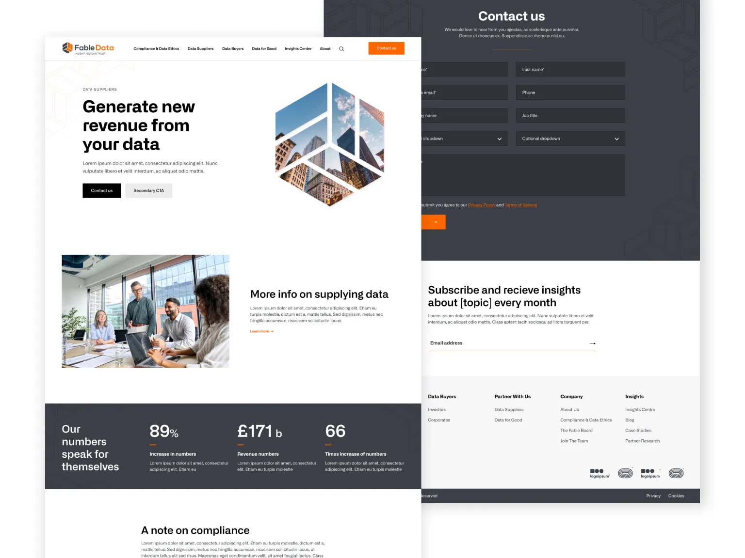
Fable Data wanted a complete redesign, transitioning to a new colour palette and type face.
Clearly defined as the brand archetype 'Sage', they wanted a clean, trust-worthy site with aspects of disruptive and bold to set them apart from competition.
Comprehensive resouces
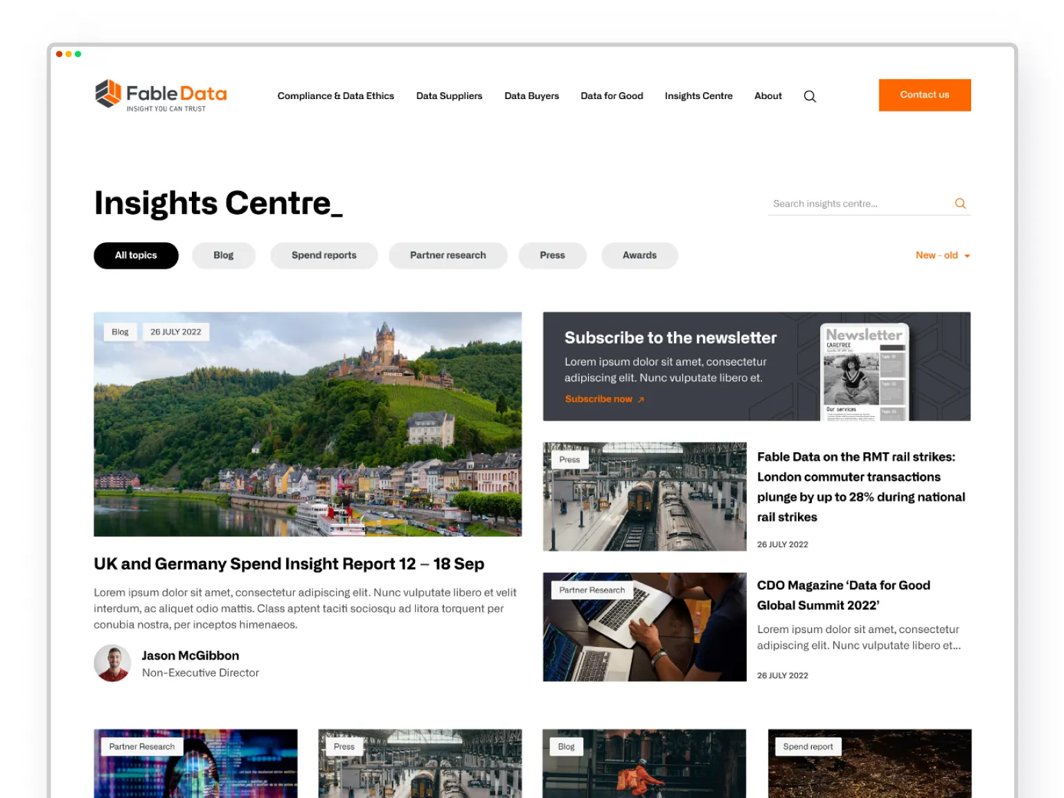
Already owning an array of excellent resources to generate leads and improve SEO - an appealing and easy to navigate Insights Centre was critical for Fable Data.
Optimised for conversions
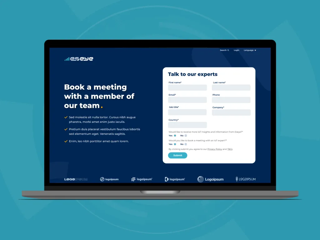
Throughout the site, offerings are strategically and clearly presented, complimented with social proof in the form of testimonials, statistics and case studies.
The strategy of the whole site is around converting users, and the gated content on the right is a great example of webdesign which primes the user for take action.
User first
With a compelling and interesting design and helpful content right where you need it, this design is thoroughly focused on UX.
