Abusix
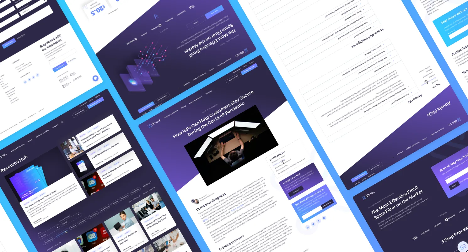
Resources refresh
Face lift to the resource hub to help promote gated content and implement a more UX friendly filter system.
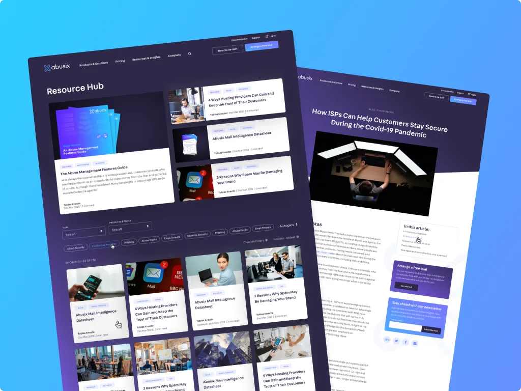
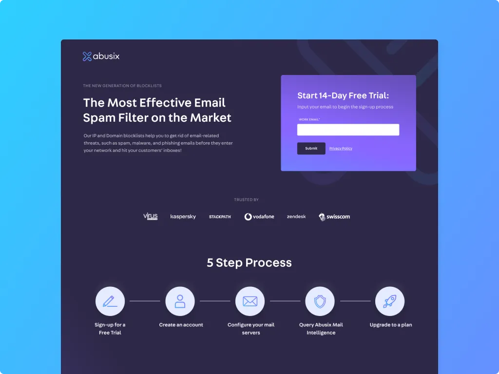
New free trial sign-up
I re-designed the free trial page to better respond to smaller screen sizes and include social proof above the fold. The 5 step sign-up process was also simplified to allow users to skim read important information.
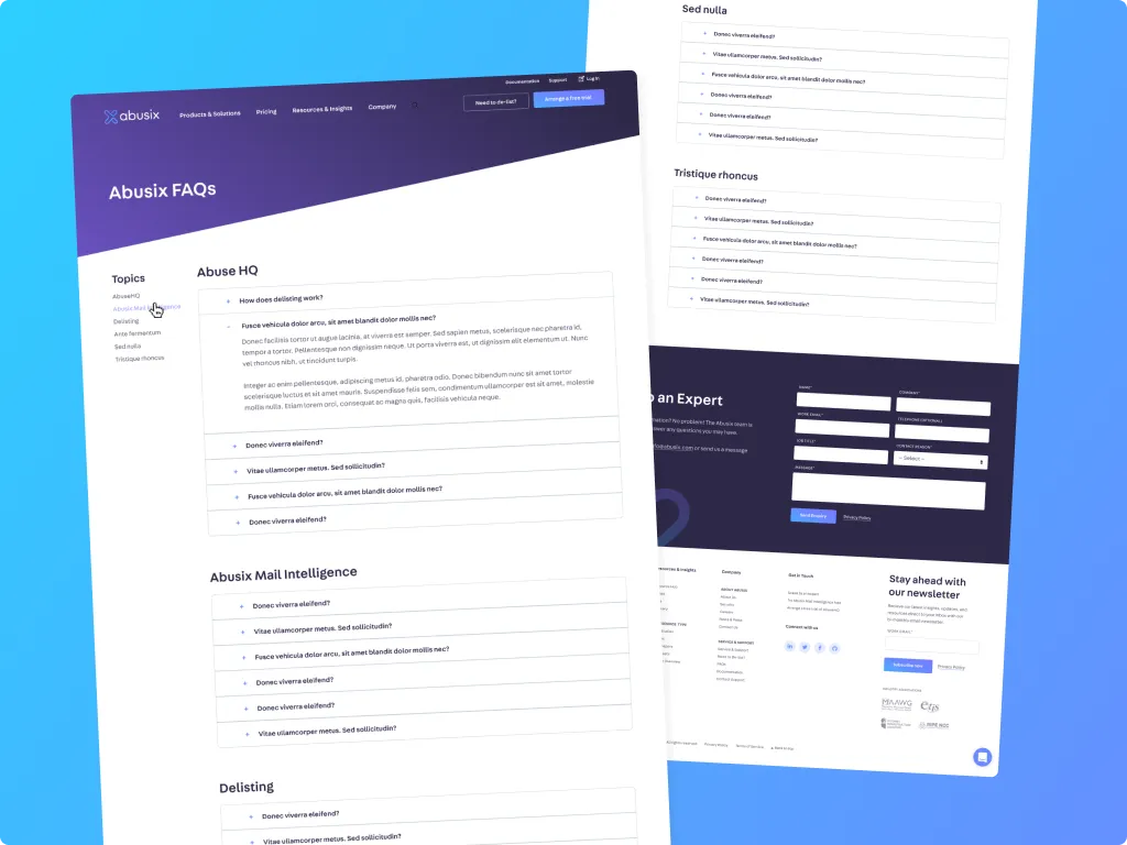
FAQ page
A modern FAQ page with anchor links and sticky scrool to create a seemless user experience while navigating the question centre.
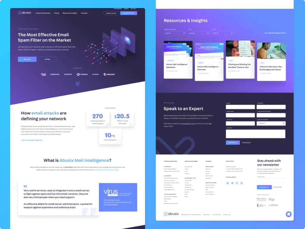
New product pages
Largely using existing modules, this new product page better highlights the benefits and success of Abusix's products.


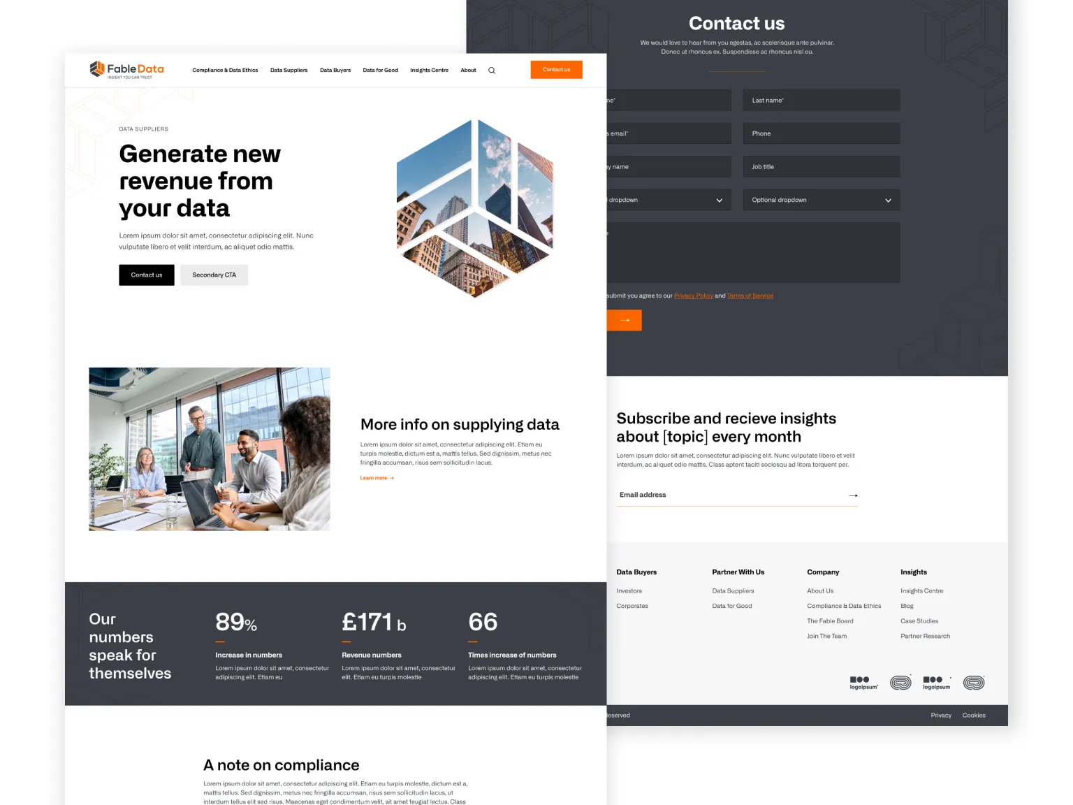
Brand new look and feel
Fable Data wanted a complete redesign, transitioning to a new colour palette and type face.
Clearly defined as the brand archetype 'Sage', they wanted a clean, trust-worthy site with aspects of disruptive and bold to set them apart from competition.
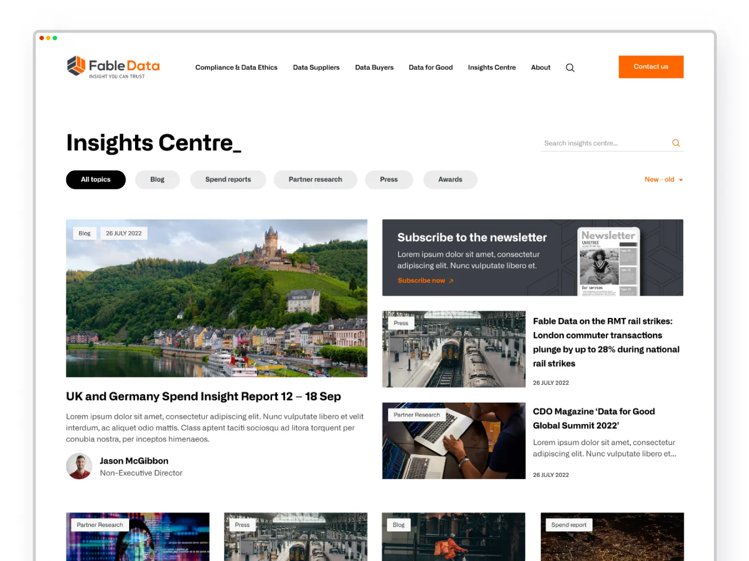
Comprehensive resouces
Already owning an array of excellent resources to generate leads and improve SEO - an appealing and easy to navigate Insights Centre was critical for Fable Data.
Optimised for conversions
Throughout the site, offerings are strategically and clearly presented, complimented with social proof in the form of testimonials, statistics and case studies.
The strategy of the whole site is around converting users, and the gated content on the right is a great example of webdesign which primes the user for take action.
User first
With a compelling and interesting design and helpful content right where you need it, this design is thoroughly focused on UX.
